Audit Your Top Navigation: Click Depth and Context
Your website’s top navigation is like a map. If the map is confusing, your visitors will get lost. Want to keep them happy and clicking? It’s time to audit your navigation. Let’s go on a little adventure—fun, simple, and super useful!
Why Top Navigation Matters
Top navigation is often the first thing visitors see. It tells them where they can go and what your site offers. But if your links are buried deep or labeled oddly, people won’t find what they need. They’ll bounce. That means lost traffic, lost leads, and maybe even lost sales.
Don’t worry, though. We’ve got your back. Let’s untangle the mess and clean up that nav bar!
What Is Click Depth?
Click depth refers to how many clicks it takes to get from the homepage to a specific page on your site. Simple, right?
- Click depth of 1: The page is directly on the main menu.
- Click depth of 2: One click from the homepage to a category, one more to a subpage.
- Click depth of 3 or more: Things start getting tricky.
The deeper the click depth, the harder it is to find info. People don’t want to go on a scavenger hunt. They want answers—fast!
Check Your Current Navigation
Start by looking at your current navigation with fresh eyes.
Ask yourself:
- Do users need more than 3 clicks to reach important pages?
- Are names of links clear and easy to understand?
- Is everything organized logically?
- Does it look clean—not crowded?
If you’re already shaking your head, don’t worry. You can fix it. And it doesn’t take a master’s degree in web design.
Tools That Can Help
You don’t have to guess. Use tools to see what’s really happening. Some cool ones include:
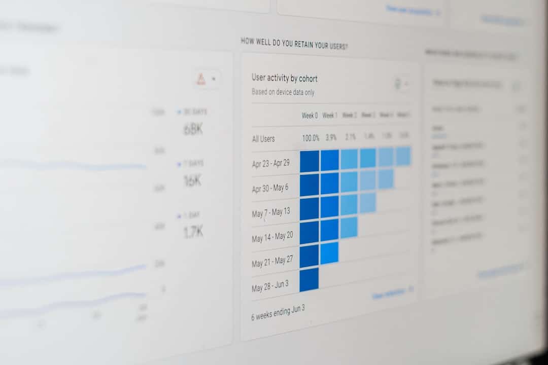
- Google Analytics: Find out which pages users visit most—or ignore.
- Hotjar or Crazy Egg: Watch click maps and user behavior.
- Screaming Frog: Crawl your site and see your exact site structure.

Look at traffic flow. Which paths are easy? Which ones are abandoned? These tools will help you spot problems fast.
Trim the Fat
Sometimes, less is more. If your top menu looks like a menu at a diner—pages and subpages everywhere—chances are it’s overwhelming.
Try this:
- Keep it to 5–7 top-level items. Research shows people can only hold about 7 things in short-term memory.
- Group related pages. Use dropdowns, but don’t go too deep.
- Cut or combine pages. If two pages do the same thing, make them one!
Pro tip: Ask non-techy friends or family to navigate your site. If they get confused, that means something’s not right.
Context Is Everything
Don’t just think about structure. Think about context. What do your users want when they come to your site? Your navigation should reflect their goals—not your org chart.
For example:
- If you run a bakery, “Cakes,” “Cupcakes,” and “Custom Orders” make more sense than “Services,” “Products,” and “Contact.”
- If you’re a tech company, “Solutions,” “Industries,” and “Resources” might work better.
Match your navigation to what people are actually looking for.
Make Language Clear
No one wants to decode a puzzle. Avoid jargon or corporate-speak in your menu items.
Which sounds better?
- “Let’s Work Together” or “B2B Partnership Initiative Framework”?
- “Our Team” or “Organizational Personnel Overview”?
We told you this would be fun. Call it what it is. Keep it human.
Your Sitemap Isn’t Sacred
You might feel attached to your current structure. Maybe you spent hours building it. Maybe it looked great in wireframes. But if users can’t click through it easily—it’s not working.
So be brave. Break things. Mix and match. Test changes and see what works. Your sitemap should serve your users, not the other way around.

How to Test Your New Navigation
Once you’ve cleaned things up, now comes the fun part: testing it!
Try these tests:
- First-click test: Ask users where they’d click to find “your return policy” or “pricing.”
- Time to goal: Measure how long it takes to complete a task (like finding a contact page).
- Navigation tree tests: Tools like Optimal Workshop let you test new menu structures without redesigning anything.
Test. Tweak. Test again. Like a chef tasting soup until it’s just right.
Be Mobile-Minded
Don’t forget mobile! Over half of all web traffic comes from mobile devices. If your navigation looks amazing on desktop but turns into a 12-step maze on mobile, you’re gonna lose people.
Tips for a mobile-friendly nav:
- Use icons wisely. Keep things familiar—think hamburger menus, home icons, and clear labels.
- Limit levels. Long dropdown chains are hard to tap on a phone.
- Make buttons big enough. Fat thumbs, remember?
If it’s not perfect on mobile, go back and adjust. Your future customers will thank you.
Time for an Audit Checklist!
Here’s a quick list to make sure your navigation is in tip-top shape:
- ✅ Are your top pages 1–2 clicks from home?
- ✅ Are your labels clear and jargon-free?
- ✅ Do you have 5–7 main menu items?
- ✅ Are dropdowns logical and easy to scan?
- ✅ Is your mobile nav simple and functional?
- ✅ Have you tested with real users?
If you’ve ticked most of those boxes—you’re doing great!
Final Thoughts
Improving your navigation isn’t just about moving links around. It’s about creating a better experience. Helping visitors find what they need. Making your site easier to use. And yes, even having a little fun along the way.
Your top navigation is like the doorway to your digital home. Keep it neat, welcoming, and easy to walk through. Regular audits help keep things shiny and smooth.

So grab your flashlight, dig into that sitemap, and make the path brighter for your visitors. You’ve got this!