Designing a Military-Style Patch Logo: Symbols, Hierarchy, and Color Rules
Military-style patch logos have transcended their traditional use in the armed forces to become a popular design choice in fashion, esports, motorcycle clubs, and corporate branding. These designs are both functional and symbolic, often inspired by history, conflict, camaraderie, and valor. Designing such logos requires careful thought about symbolism, visual hierarchy, and color usage to effectively convey purpose and identity.
TL;DR
Designing a military-style patch logo involves selecting bold and meaningful symbols, organizing elements based on visual and informational hierarchy, and adhering to a disciplined color scheme. Key icons like shields, swords, and stars often anchor the theme, while muted colors and defined borders help communicate strength, unity, and authority. Understanding the heritage of military insignia can help designers make logos that feel authentic and intentionally crafted.
Symbolism: Choosing the Right Icons
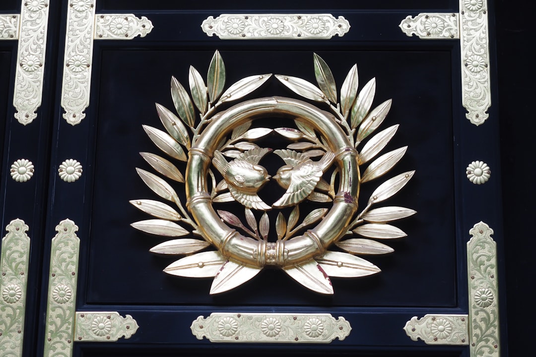
Symbols are central to military-style patch design. Each element, from weapons to wings, carries a historical or metaphorical meaning. In military insignia, symbols are not decorative; they are deliberate and informative. Translating that same principle into modern designs is crucial.
Commonly Used Military Symbols
- Shields: Represent protection, defense, honor.
- Swords and Daggers: Symbolic of courage, offense, and active duty.
- Stars: Rank, achievement, or connection with military branches like the U.S. Army or Air Force.
- Wings: Air forces, swiftness, or ascension.
- Skulls: Fearlessness, combat readiness, or special operations.
These symbols should be chosen based on the group’s values, purpose, or mythology. For instance, a tactical training company might use crossed rifles and targets, while an esports team might opt for cyberpunk-style skulls or robotic wings.

Hierarchy: Organizing Elements with Purpose
In patch design, visual hierarchy ensures the most important elements get the attention they deserve. Military patches typically separate design zones: top banners, central emblem areas, and bottom identifiers or tags.
To preserve authenticity and improve readability, consider the following structure:
Typical Patch Zones
- Top Arc/Banner: Usually contains the unit or group name.
- Central Emblem: This is the main graphic — the heart of the design. Often a symbol like a shield overlaid with a skull or wings.
- Bottom Banner: Used for mottos, numbers, or years founded.
All elements should scale and align with one another. Avoid clutter by ensuring that no more than 3 major symbols dominate the design. Balance is key in delivering a clean yet powerful insignia.

Color Rules: Authentic and Tactical Palettes
One hallmark of military-style designs is a disciplined color scheme. Bright, varied hues rarely exist in real military patches. Instead, these patches reflect utilitarian values by using practical and muted tones.
Recommended Color Palettes
- Olive Drab & Green Variants: Ideal for land-focused units.
- Gray & Navy Blues: Suitable for naval and air force themes.
- Black & Charcoal: Used for tactical, special forces, and elite groups.
- Tan & Sand Colors: Represent desert environments or versatile camouflage.
Use no more than 3–4 colors in the primary design to maintain cohesion. Contrast should be reserved for outlines and accents. Additionally, text elements (like mottos or unit identifiers) should be either high-contrast or subdued depending on their prominence in the layout.
Pro Tip: Avoid gradients and glowing effects. They rarely appear in authentic military patches. Stick to flat colors and strong borders to maintain realism.
Typography: Fonts That Command
Typefaces should echo the grit, formality, and strength of the military aesthetic. Block sans-serifs work well, especially those that are clean but bold enough to withstand embroidery or patch printing.
Popular Choices
- Stencil Fonts
- Impact-Style Bold Fonts
- Monospaced Fonts for Codebreakers or Cyber Units
Letter spacing and arched alignment are traditional in patch design. Top banners may feature arched text to simulate real patches stitched onto uniforms. Don’t overuse symbols in place of letters (e.g., skull replacing “o”); these should be used sparingly, if at all.
Shape and Size Considerations
Classic patch shapes include circular, shield-shaped, hexagonal, and arrowhead designs. Choosing the right outline affects not only aesthetics but also how well a design fits onto clothing or digital platforms.
Common Patch Shapes
- Circle: Versatile, compact, and traditional.
- Shield: Conveys defense and credibility.
- Chevron/Arrowhead: Often denotes rank or direction.
- Hexagon: Modern and mechanical applications.
Designers should remember to maintain symmetry in shape and element placement unless asymmetry is central to the message or branding.
Modern Usage Adaptations
Today’s military-style logo patches find their place far beyond uniforms. Clothing brands, adventure gear companies, esports teams, and even startup brands leverage this bold visual language to communicate strength and cohesion.
Unlike real military insignia, designers can sometimes experiment with non-traditional symbols such as tech-related icons, digital motifs, or science fiction influences — as long as the design retains the discipline of visual hierarchy and strong symbolism.

Conclusion
Designing a military-style patch logo is both a creative and strategic undertaking. Symbols, visual hierarchy, and tactical colors are more than style—they are signals. Every element must serve a purpose, and every graphic should enhance the message of unity, strength, and story. When done right, a military-style patch logo resonates with credibility and intention, whether stitched onto a sleeve or showcased in a digital campaign.
Frequently Asked Questions (FAQ)
- Can a military-style patch logo be funny or lighthearted?
- Yes, but you should use irony in combination with strong symbols to maintain the structure of the style. Humor should be subtle, like a pun in the motto or a sarcastic emblem.
- Is it okay to mix traditional military symbols with modern or fictional elements?
- Absolutely. Many contemporary designs blend old symbols like shields with sci-fi elements or cyberpunk themes. Just keep the design principles intact.
- What design tools are best for creating patch logos?
- Vector design tools like Adobe Illustrator, Affinity Designer, or CorelDRAW are best. Patches often need scalable, clean outlines for embroidery and printing.
- How important is historical accuracy in the design?
- It depends on your audience. If you’re designing for actual veterans or military organizations, accuracy is critical. For commercial or fictional use, authenticity in style may suffice even if details are invented.
- Should I design the logo with embroidery in mind?
- Yes, if the patch will be physically produced. Avoid gradients, reduce tiny details, and keep strokes thick enough for threads to define clearly.