
Tools for Detecting Free Trial CTAs on Websites: How to Identify Free Trial Calls to Action Across Websites and Analyze Their Placement, Messaging, and Conversion Strategy
The best way to detect free trial CTAs across websites is to combine automated page crawling, visual capture, text extraction, and conversion analysis. A free trial call to action is not just a button that says “Start Free Trial.” It can appear as a sticky header link, a pricing card button, a pop-up, a chatbot prompt, or a soft CTA buried inside product copy. The goal is to find each CTA, record where it appears, study the wording, and connect it to the conversion path.
TLDR: Use a mix of tools such as Screaming Frog, Sitebulb, BrowserStack, Hotjar, Microsoft Clarity, BuiltWith, and visual scraping tools to find and analyze free trial CTAs. For example, a SaaS team auditing 120 competitor pages may find that 68% place “Start Free Trial” above the fold, while only 22% mention “no credit card required” near the button. That kind of data helps teams adjust CTA placement, reduce friction, and improve trial signups without guessing. The strongest audits track button text, page location, device view, offer details, and post-click flow.
What Counts as a Free Trial CTA?
A free trial CTA is any prompt that asks a visitor to begin using a product without paying upfront. Some are blunt. Others are soft and easy to miss.
- Direct CTAs: “Start Free Trial,” “Try Free,” “Get Started Free.”
- Risk-reduction CTAs: “Try it free, no credit card required.”
- Product-led CTAs: “Create your first project.”
- Pricing CTAs: “Start 14-day trial” inside a plan card.
- Exit or overlay CTAs: Pop-ups offering a trial before the user leaves.
Honestly, it feels like many audits miss half the story because they only scan homepage hero buttons. Free trial prompts often appear deeper in product pages, comparison pages, feature pages, and help content.
Core Tool Categories for Finding CTAs
No single tool catches everything. A solid CTA detection process uses several tool types working together.
1. Website Crawlers
Screaming Frog and Sitebulb are useful for scanning website copy at scale. You can crawl pages and search for phrases such as “free trial,” “try free,” “start trial,” “no credit card,” and “14 days.” Export titles, URLs, headings, anchor text, and page copy for review.
This method is fast, but imperfect. It may miss CTAs rendered by JavaScript, pop-ups, or personalized content. Still, it is a strong first pass for large sites.
2. Visual Capture and Screenshot Tools
CTA placement is visual. Text exports will not tell you if a button is above the fold, hidden in a footer, or competing with three other buttons.
Tools such as BrowserStack, LambdaTest, PagePixels, and URLbox can capture screenshots across desktop, tablet, and mobile. This helps teams compare CTA visibility by device. Expect to waste time on mobile checks if you skip this step. A CTA that looks perfect on desktop may sit three scrolls down on a phone.

3. SEO and Competitive Research Tools
Ahrefs, Semrush, and Similarweb are not CTA detectors by design, but they help identify which pages deserve attention. If a pricing page receives the most organic traffic, its free trial CTA matters more than a low-traffic blog post.
Use these tools to spot:
- High-traffic landing pages.
- Competitor comparison pages.
- Trial-focused paid search landing pages.
- Product pages ranking for buying-intent keywords.
4. Behavior Analytics Tools
Hotjar, Microsoft Clarity, FullStory, and Mouseflow show how users interact with CTAs. They reveal clicks, rage clicks, scroll depth, and hesitation.
For example, if 74% of visitors never scroll to the pricing table, then a trial CTA placed there is barely visible. If users click a non-clickable “Free trial available” badge, that is a messaging problem. People are showing intent, but the page gives them a dead end.
5. Tag and Tech Detection Tools
BuiltWith and Wappalyzer help identify tools running behind signup flows, such as A/B testing platforms, analytics suites, chat tools, and personalization software. This does not directly find the CTA, but it explains how the site may be testing or changing its trial prompts.
If a competitor uses Optimizely, VWO, Convert, or LaunchDarkly, their CTA wording may differ by visitor segment. That makes one-off audits risky. Capture pages more than once, and use clean browser sessions.
How to Analyze CTA Placement
Once CTAs are found, classify their placement. Simple categories make patterns easier to spot.
- Hero area: CTA appears before scrolling.
- Sticky header: CTA stays visible while scrolling.
- Pricing section: CTA appears inside plan cards.
- Mid-page prompt: CTA follows feature or benefit copy.
- Footer: CTA appears near final links.
- Overlay: CTA appears in pop-ups, banners, or exit prompts.
Above-the-fold placement usually wins for visibility, but not always for intent. A pricing CTA may attract fewer clicks yet produce higher-quality trials. The right question is not “Where is the button?” The better question is “What user decision happens at this point?”
How to Analyze CTA Messaging
CTA copy carries the offer, the risk, and the expected action. Track exact wording. Small differences matter.
- Action phrase: “Start,” “Try,” “Get,” “Create,” or “Sign up.”
- Offer length: 7 days, 14 days, 30 days, or unspecified.
- Payment friction: “No credit card required.”
- User outcome: “Build your first workflow.”
- Urgency: “Start today” or “Try it now.”
It drives me crazy when audits record “CTA present” but ignore the promise beside it. A button saying “Start Free Trial” next to “Cancel anytime” is not the same as the same button next to “Talk to sales for access.” One feels instant. The other adds doubt.
How to Study the Conversion Strategy
Click the CTA and map what happens next. This is where many teams find the real friction.
- Destination: Does the CTA open a signup page, checkout page, modal, or sales form?
- Form length: How many fields are required?
- Payment request: Is a credit card needed?
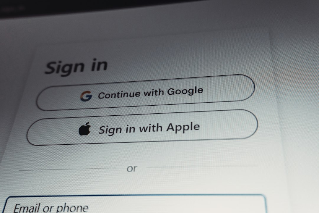
- Account creation: Can users sign up with Google or Microsoft?
- Trial activation: Does the user enter the product instantly?
- Follow-up: Are there emails, onboarding steps, or in-app prompts?
A strong free trial flow reduces delay. If a user clicks “Try Free” and lands on a six-field form plus a required phone number, the CTA has overpromised. The strategy should match the message.
A Practical CTA Audit Workflow
Use this workflow for your own site or competitor research:
- Build a URL list from sitemaps, SEO tools, ads, and top product pages.
- Crawl the site for trial-related phrases.
- Capture desktop and mobile screenshots for each key page.
- Tag every CTA by wording, page type, placement, and visual priority.
- Click each CTA and document the signup path.
- Review analytics for scroll depth, clicks, and form completion.
- Compare results against trial signups or assisted conversions.
Useful Metrics to Track
A free trial CTA audit becomes more useful when tied to numbers. Track both visibility and intent.
- CTA visibility rate: Percentage of visitors who see the CTA.
- Click-through rate: CTA clicks divided by page visits.
- Trial start rate: Completed trials divided by page visits.
- Form abandonment: Users who start but do not finish signup.
- Device gap: Difference between desktop and mobile CTA performance.
- Message test lift: Conversion change after copy changes.
For instance, a team might find that adding “No credit card required” below the main CTA lifts clicks from 3.8% to 5.1%. That is a 34% relative increase. If trial quality stays stable, the messaging change is worth keeping.
Final Takeaway
Free trial CTA detection is part crawling, part visual review, and part conversion research. Tools can find the buttons, but analysis explains why they work or fail. Study the wording, the location, the device experience, and the post-click path. That is how you turn scattered CTA data into a clearer trial growth strategy.